Project Summary
Through close collaboration with stakeholders and multiple Suntory brands, we crafted a brand strategy that gave Suntory Oceania a distinctive identity while respecting the individuality of its alcoholic and non-alcoholic offerings. With a tight deadline and a large volume of content, we focused on delivering a visually striking, user-friendly website that balanced brand impact with intuitive navigation.
My Contribution
For the Suntory Oceania website, I was involved throughout the entire project lifecycle—from research and UX/UI design to testing and handover. I collaborated closely with stakeholders through weekly WIPs and presentation meetings, aligning the design direction with both the brand designer and strategist. I also worked side-by-side with developers to ensure a smooth transition from design to development, maintaining consistency and quality across every stage.
Client:
Suntory Oceania
My Role:
Digital Lead
Year:
2025
Service Provided:
Digital Strategy
User Research
Wireframing
Prototyping
UI Design
Design System
Content Creation and SEO
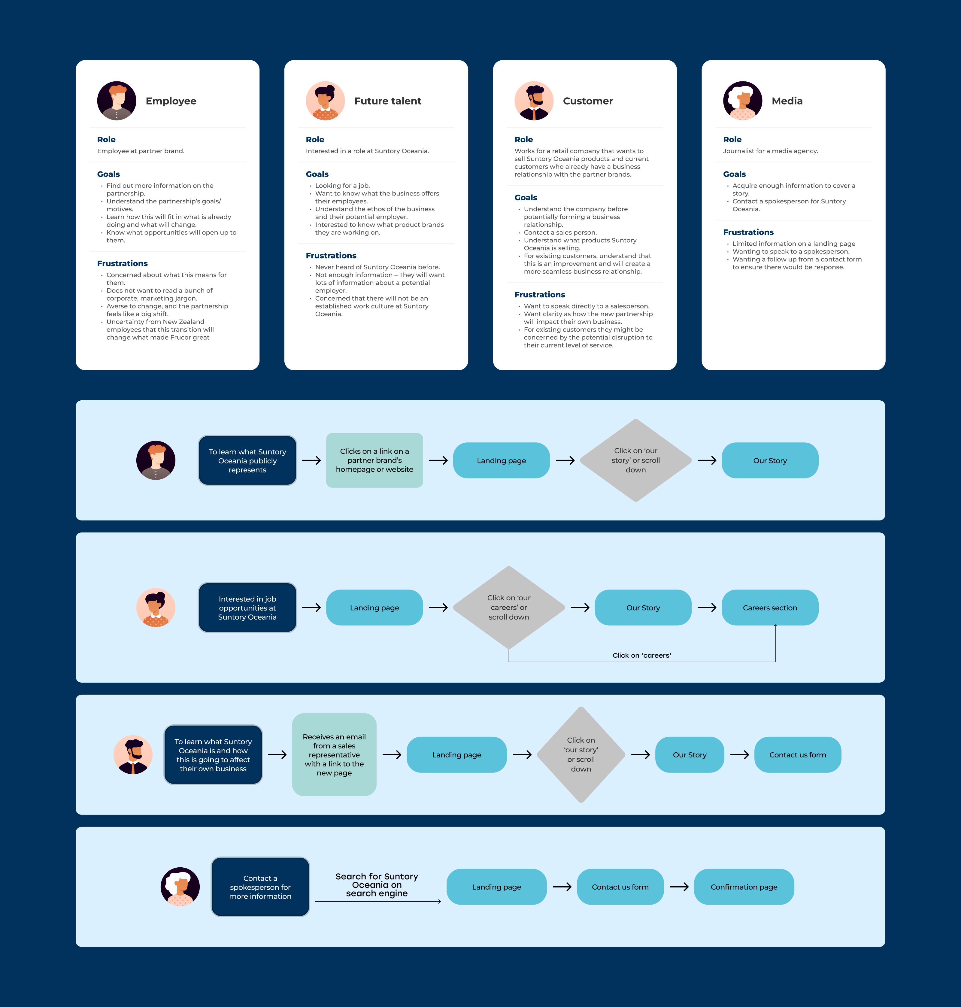
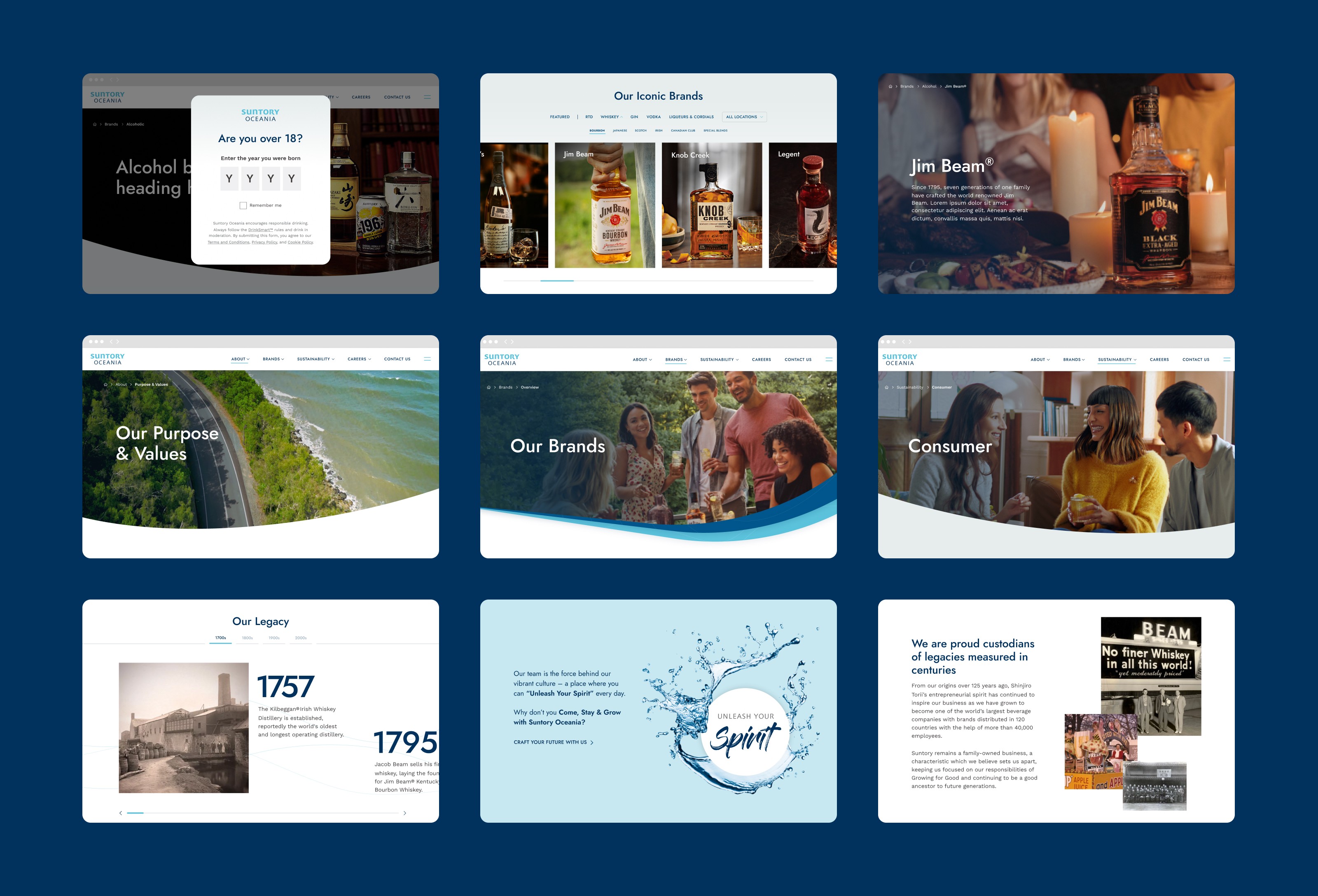
Structuring Content Around User Needs
Information Architecture Driven by User Intent
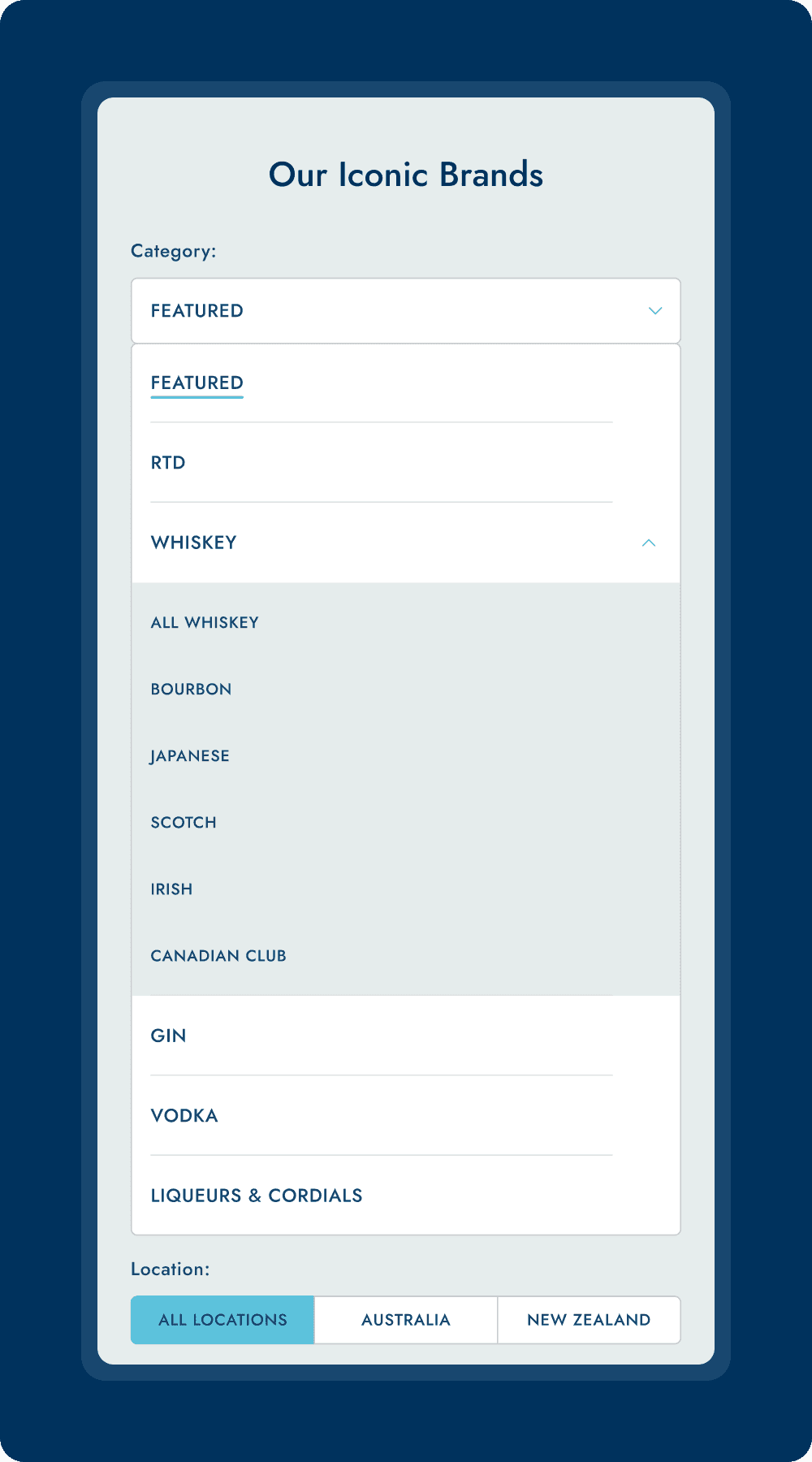
We explored multiple versions of the sitemap, carefully dividing content into categories and subcategories with a strong focus on user intent and landing behavior. Prioritising key areas like company information, sustainability, products, and brands was essential to ensure clarity and relevance.
Key intakes
Careers and the Customer Hub were positioned outside the main site, creating a clear separation for users with different intents and needs.
Cross-linking between About, Careers, and Sustainability pages was essential to support continued exploration and help users easily find related information.
Careers, Brand Commitment, and Company Values were identified as three key content pillars central to the Suntory brand, and were therefore given prominence on the homepage.
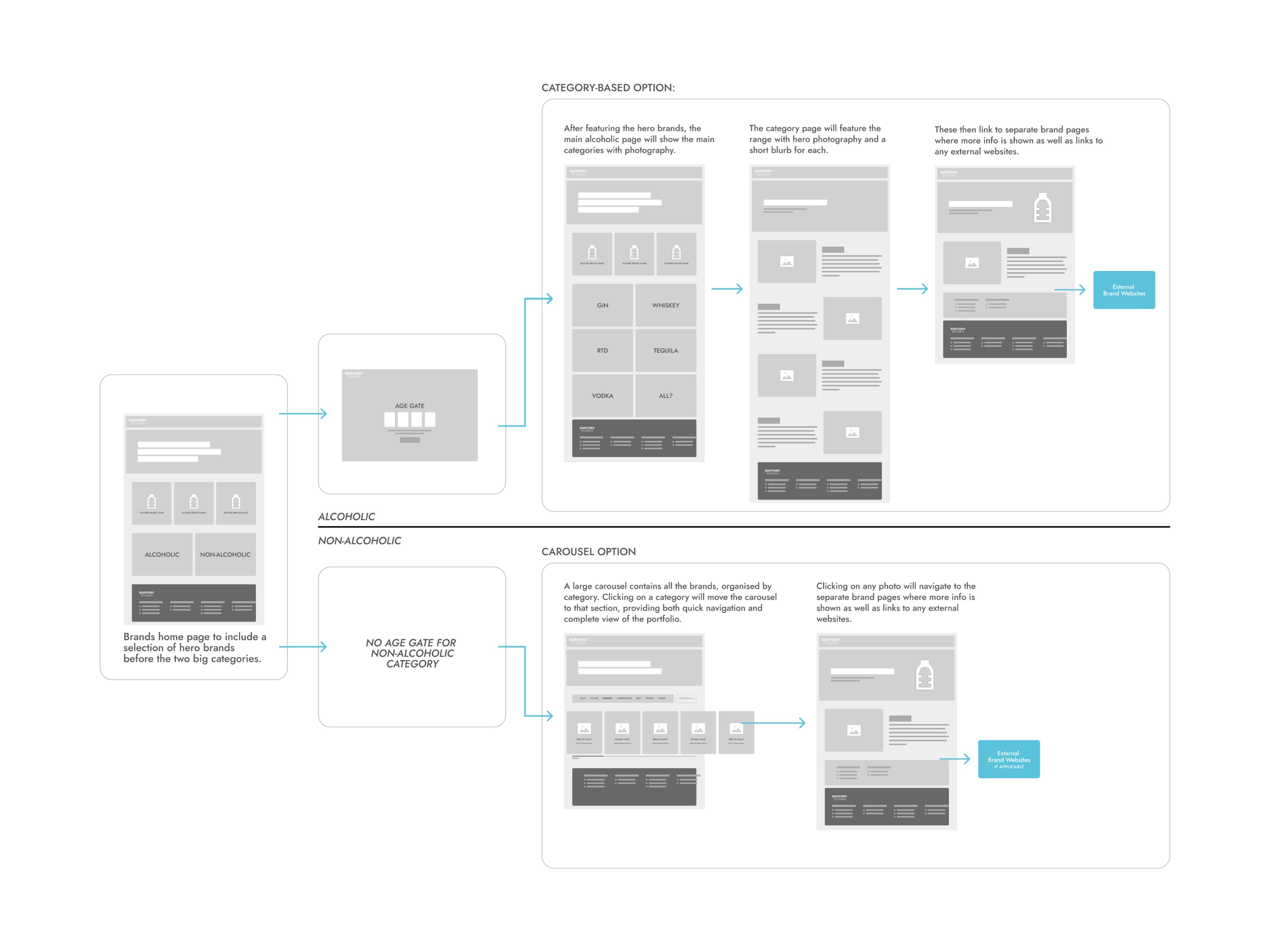
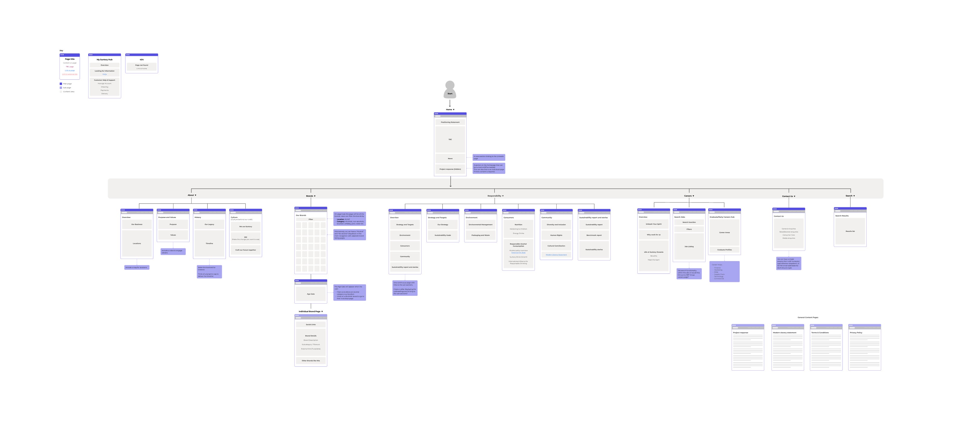
From Structure to Interactive Experience
Screen flows were created based on context and complexity. For example, detailed screen flows were used for brand pages to map how users search for specific products and access relevant information efficiently. Once the sitemap and screen flows were approved, wireframes were developed for all pages, with close collaboration with the copywriter to ensure layouts were driven by content. These wireframes were then combined into an interactive prototype and tested with users to validate navigation, findability, and overall usability.
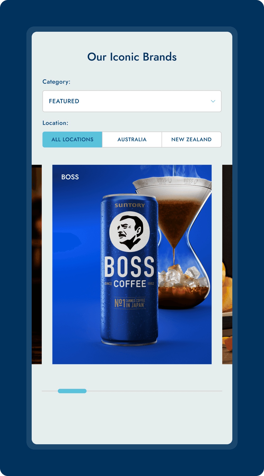
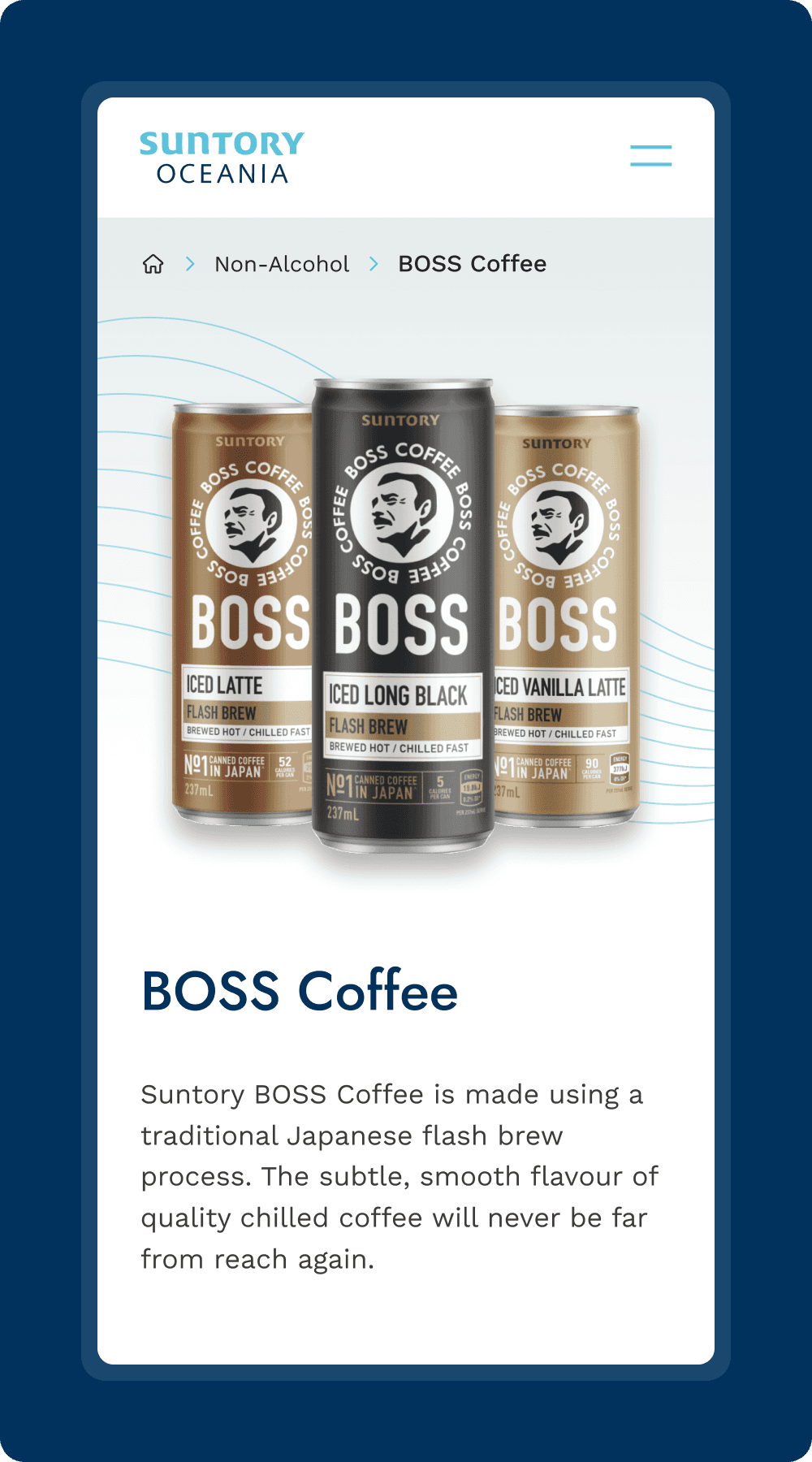
Translating Brand into Digital UI
Building on the wireframes and new branding, the UI design was developed to align closely with existing print materials, ensuring a cohesive brand presence across both digital and physical touchpoints. Particular attention was given to elements like fonts, colours, patterns, animation, and image rendering to maintain brand consistency while enhancing digital usability. Additionally, a dedicated UI library was created to support the specific needs of digital platforms, enabling scalable and consistent design across the website.
Sustainability, Accessibility, and Maintainability
The CMS update was a key focus ahead of the website’s final launch. As ongoing client-led updates were essential, we invested time in understanding the CMS structure and worked closely with developers to shape a flexible, easily maintainable design.
We also prioritised sustainability by delivering lightweight code and applying energy-efficient practices such as image optimisation, alongside SEO best practices and WCAG-compliant accessibility standards. These considerations aligned strongly with the sustainability and ethical values of Suntory Oceania.
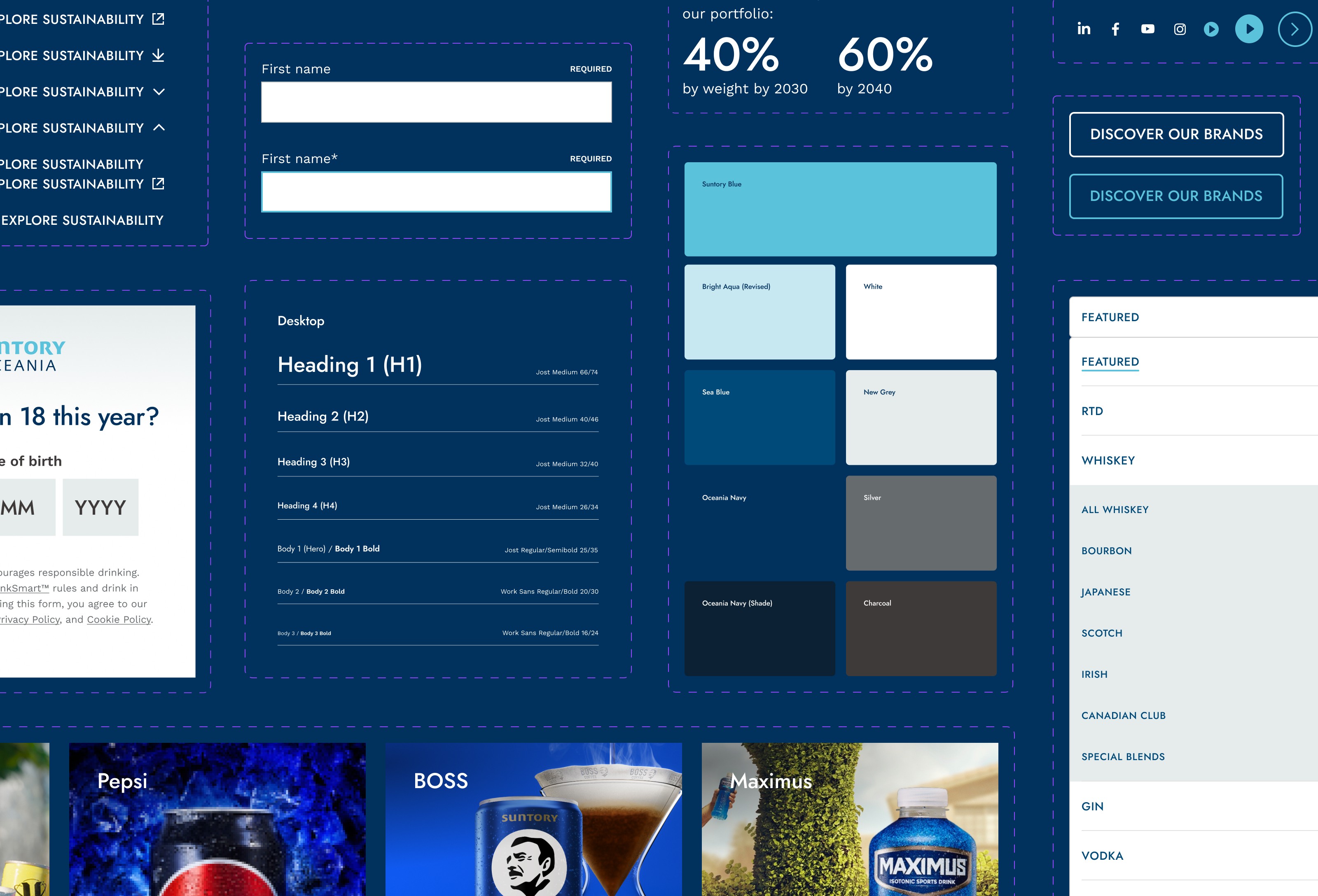
A User-Driven Design System
A Suntory Oceania design system was created as a single source of truth. This was essential for future use, as the client would continue to participate in website updates and needed designs to remain coherent and consistent.
During development, we worked closely with the Suntory Oceania team to ensure the design system was clear and easy to adopt. Rather than creating overly generic components, we designed components based on how users interact with specific features, avoiding rigid, template-like patterns while maintaining consistency.
Key takeaways
Understanding the audience
Deep understanding of the audience underpinned every decision, using research and testing to validate assumptions, address user frustrations, and ensure solutions were evidence-based.
Proactive communication
Working closely with the team and stakeholders to collaboratively develop solutions, while also taking initiative and making informed design decisions when needed.
Prioritisation and multitasking
Effective prioritisation and multitasking were critical, balancing work across multiple areas of the project and collaborating with other designers while awaiting feedback on parallel streams.