
Project Summary
My Contribution
Client:
Australian Government - be Connected
My Role:
UX Designer
Year:
2025
Service Provided:
UX Audit & Design
User Research
User Testing
Analysis and Reporting
Project Background & Research Alignment
First, as a team, we aligned on the project background and clearly defined the research goals. This step was essential to ensure everyone had a shared understanding of the context, history, and factors that led to the current state of be Connected and its digital offerings.
Research goals
Evaluate how easily users can find the course they are looking for.
Define clear process stages and navigation cues to improve user orientation and reduce confusion throughout the journey.

Analyse and prioritise accessibility issues to ensure critical services are accessible, compliant, and usable for all users.
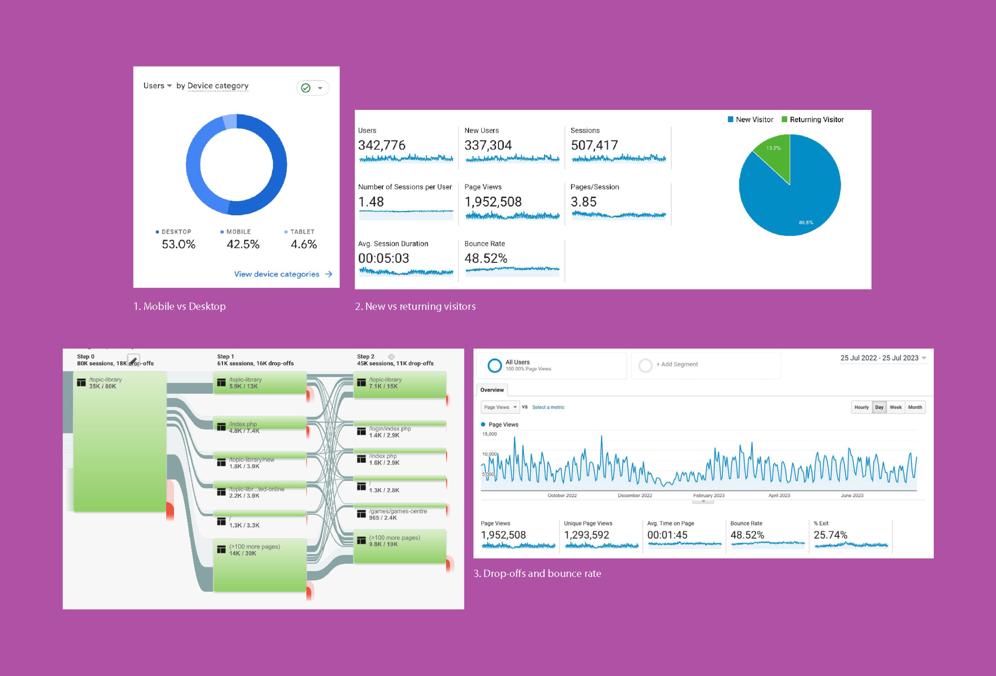
Analyzing User Journeys with Analytics

User interviews and Affinity Diagrams
We conducted early user interviews to understand pain points within the existing site. Moderated online usability sessions were carried out, where users were guided through key tasks such as finding and completing a course. Research findings and observational data were synthesised and organised into related groups. An affinity diagram was then used to identify common themes and patterns, enabling the formation of actionable insights.
Course Structure
The hierarchy from content → topic → course → activity needs to be clearer so users can easily understand the structure. There should be also less clicks for users to get to the final activity.
Course Search
The course search experience needs to be more clearly articulated to help users explore, filter, and locate courses that match their interests.
Course Activities
Activities should be more engaging and interactive. Clear progress and performance indicators would help motivate users and encourage continued course participation.

Course search user journey - before (top) & after (bottom)
Optimising the Course Search Experience
One of the key pieces of feedback from users was confusion around the journey to find a course. This was also reflected in analytics, which showed users frequently moving back and forth between pages during search, and in some cases abandoning the site altogether.
To address this, we mapped the existing end-to-end user journey for finding a course. This revealed that users were navigating an average of 5–7 pages before reaching a course. We then identified areas of content overlap, unnecessary steps, and points of friction within the search flow.
Based on these insights, we simplified the information architecture and restructured the course search experience by removing redundant steps and clarifying content hierarchy. As a result, the user journey was significantly streamlined, enabling users to find courses more efficiently and with less friction.

Course search page - before (left) & after (right)
Removing Redundancy in Course Discovery
Based on these findings, we redesigned the course search page. Previously, Topics, Courses, Articles, and Podcasts were all searchable at the same level. However, since Courses sit within Topics, this structure created unnecessary duplication and confusion. In addition, Articles and Podcasts were already accessible on a separate page, resulting in repeated information and a fragmented search experience.
To simplify the experience, we refocused the search page to display Topics only. The topic tile interface was enhanced to include key information such as duration, level, and number of courses, allowing users to quickly understand the scope of each topic without needing to click through.
We also introduced a new “Quick View of Courses” feature within each topic tile, enabling users to preview the available courses directly from the search results. These changes significantly reduced cognitive load and made course selection faster, clearer, and more efficient.

Activity page - before (left) & after (right)
Improving Activity Progression and Accessibility
Updates were made to the activity pages to improve course progression and accessibility. Each course consists of multiple activities, but in the original design, users could only access and complete activities individually, with no visibility of or connection to related activities.
To address this, we introduced a side navigation that displayed all activities within a course. This helped users understand the overall course structure, encouraged them to continue with additional activities, and clearly showed progress through completed activities. As a result, the number of users completing multiple activities within a course increased.
User feedback also highlighted discomfort caused by automatic scrolling and motion within activity pages. To address this, we recommended removing these movements to reduce disorientation and cognitive strain.
Further accessibility testing was conducted with vision-impaired users and users with hearing difficulties. Based on these tests, we recommended improvements including enhanced screen reader compatibility and the addition of closed captions for video content, ensuring a more inclusive and accessible learning experience.
Synthesis, Design & Quality Assurance
The final insights were synthesised and presented to stakeholders. Findings from data analysis and user testing were consolidated into clear insights, with actionable UX and UI design recommendations. Each recommendation was supported by visual design to ensure stakeholders had a clear and shared understanding of the proposed changes.
Following positive feedback from the team, the recommendations were refined and implemented. A final round of QA testing was then conducted to ensure the updates met the intended usability improvements.
Next Steps
Plan further data analysis to measure whether the implemented changes result in measurable improvements in key metrics.
Conduct additional user testing with revised questions and scenarios, focusing on filtering and navigation to validate usability improvements.
Explore scalable options for updating and managing course listings as the volume of available courses continues to grow.